introducing apparel arts, 1931

Was the holiday season of 1931 a good moment to launch a pricey magazine for the men's fashion trade? The backers of Apparel Arts felt so.
"We prefer not to brag about the expensive character of Apparel Arts," editor Arnold Gingrich noted in the magazine's debut editorial. "You all know, by now, what a photograph costs. You can guess, when it comes to drawings, paintings and sculpture. The Depression still being officially on, we're rather ashamed to admit payment to the piper. To dwell on this aspect of Apparel Arts, quite apart from considerations of modesty, would be, it seems to us, to elucidate the obvious."
Apparel Arts was distributed to clothing salesmen, and included swatches attached to pages that could be shown to clients. "Our only hope," Gingrich declared," is that each issue may contain some one page, at least, that you may find it impossible to ignore, or to forget." The magazine's mission would be "to fight for the maintenance, or for the restoration, should it come to that, of quality standards in both the manufacture and the retailing of men's and boys' apparel."
For the debut cover, Gingrich chose a symbolic design. "Its central figure is Civilization, representing the span between primitive man in his nakedness and modern man in his civilized dress. The decorative relief represents the animal and vegetable sources from which man has wrested the materials of his apparel."

Illustration accompanying a feature on Brooks Brothers, depicting its original New York City location.
Features included manufacturer and retailer profiles, colour theories, window displays at Marshall Field, and a history of the Arrow Collar Man.


Click on images for larger versions.
Also included: an encyclopedic chart covering animal sources for leather gloves. Readers were encouraged to cut up the magazine to suit their educational and sales needs (and order extra copies if they also wanted to keep complete issues).

The editorial noted that "advertising in Apparel Arts has been selected rather than collected. Every advertiser stands, in his product, for what we stand for: the maintenance of a quality standard. There is not, to the best of our knowledge and belief (and we know that these are days of rapid ups and downs) a single sub-standard maker among them."
The result was plenty of stylish period ads, which look great even on black and white microfilm. Though it's one letter off from my name, I might be partial to this upstate New York clothier. This was also an era when almost anything connected to business could have a "romance" to it.

Arrow shirts for professional use...
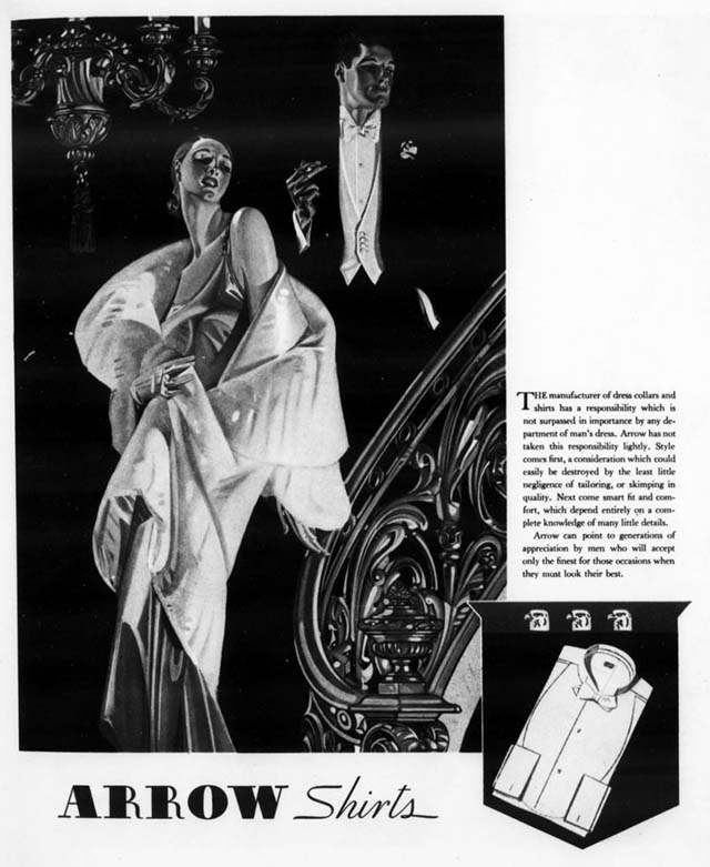
...and a night on the town.

A fashionable item saluting the recently-built Empire State Building.

Another recently-built New York landmark took out an ad, spotlighting the rising skyline of early 1930s Manhattan. The building was later converted into a Ritz-Carlton hotel/condo.
In 1933 Apparel Arts' publishers launched another men's fashion magazine edited by Gingrich, Esquire, which drew a broader audience by adding short stories from leading writers and other male-centric content. Apparel Arts switched to quarterly publication in 1957, adopting the subtitle Gentleman's Quarterly. Over the next year, GQ gained greater prominence on the cover until the old name was dumped for good with the Spring 1958 issue.
You can read the entire first issue of Apparel Arts at the Internet Archive.


Comments